


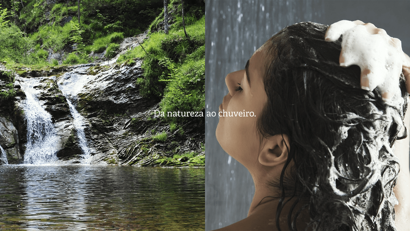
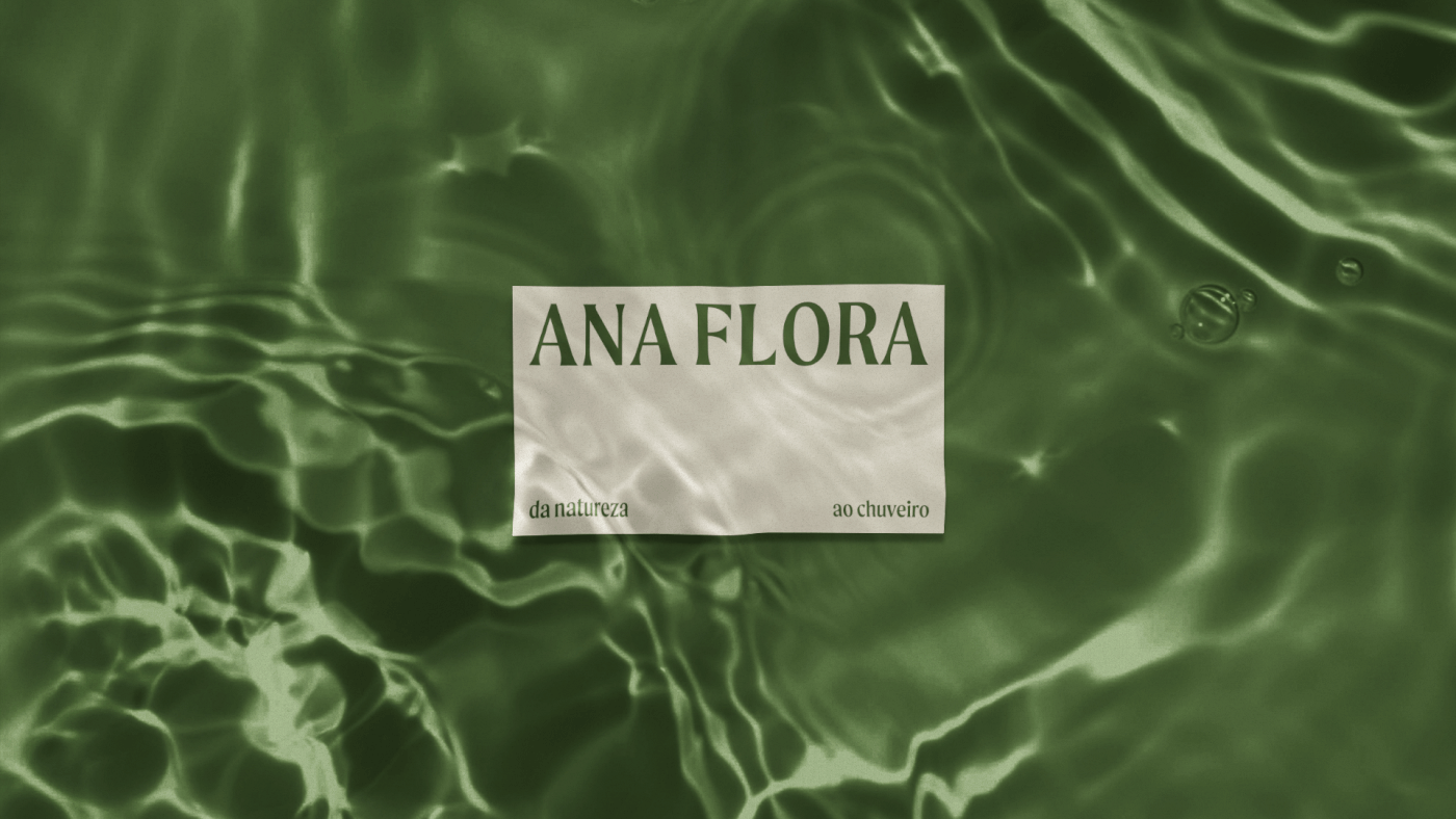
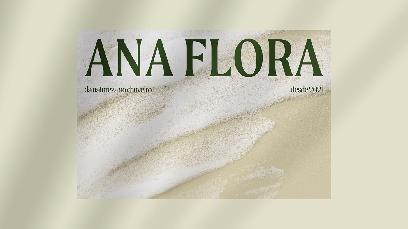
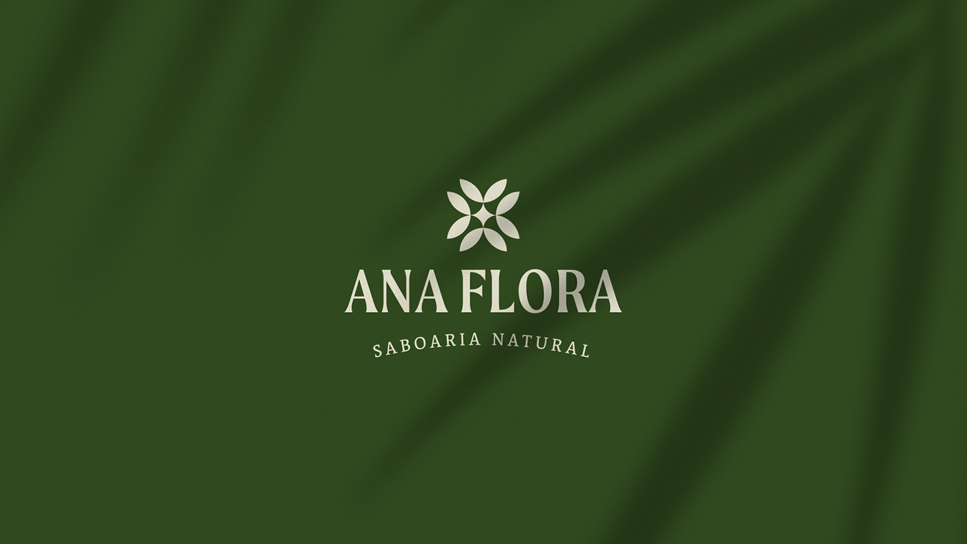
Ana Flora. Da natureza ao chuveiro.
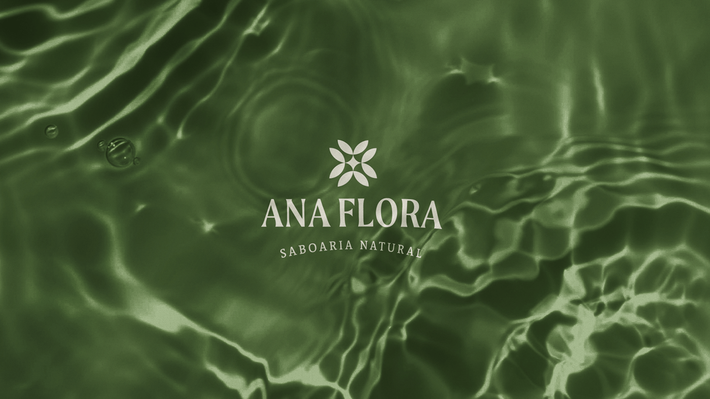
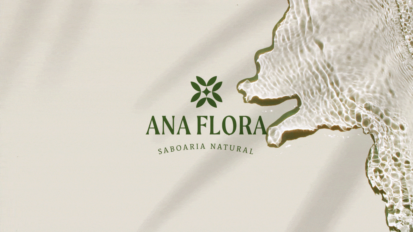
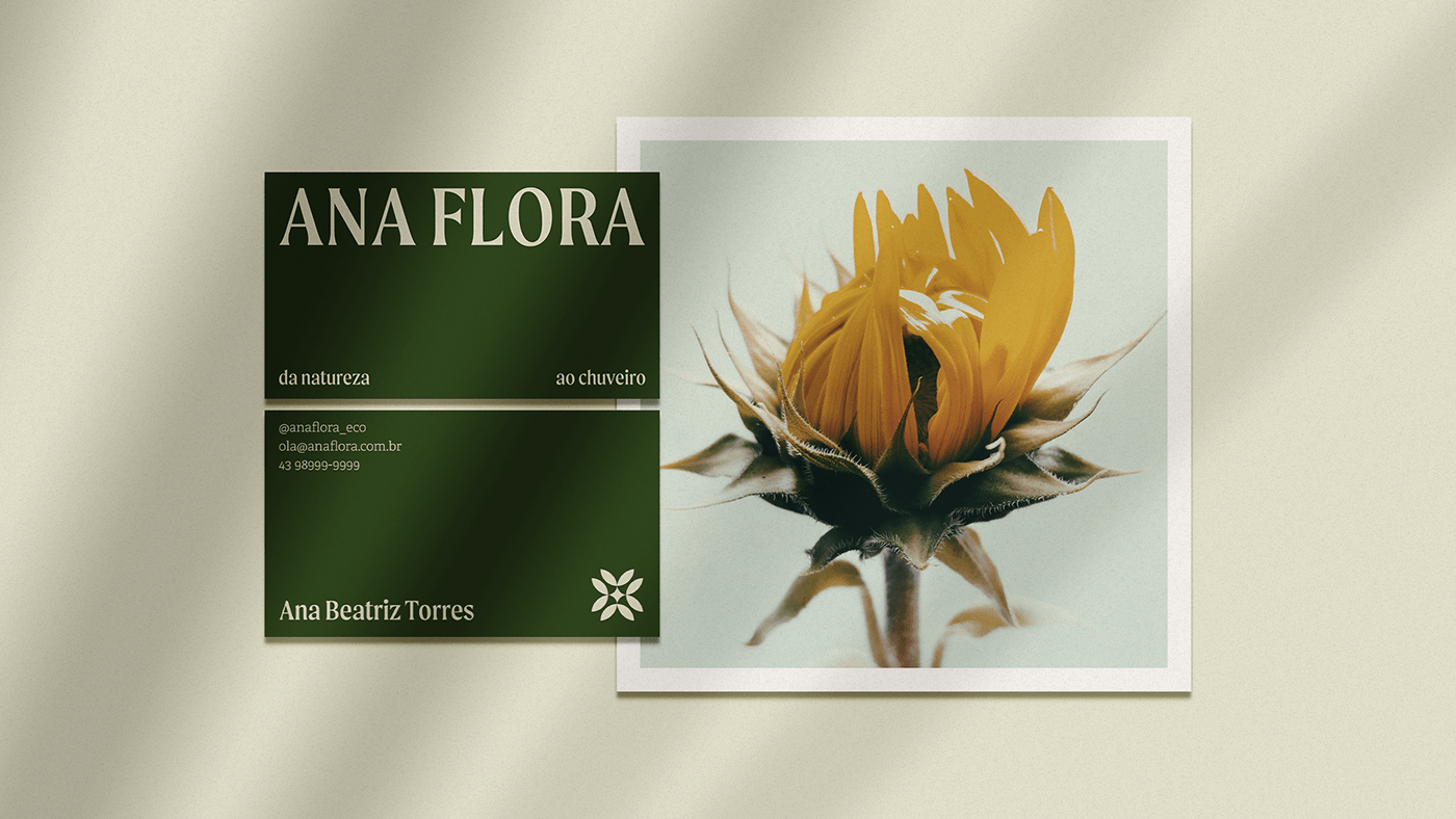
A Ana Flora é uma saboaria natural e artesanal que surgiu do interesse mútuo em cuidar das pessoas e da natureza. Fundada por Ana Beatriz, agrônoma e apaixonada pela natureza, sua marca é um reflexo da sustentabilidade e do cuidado.
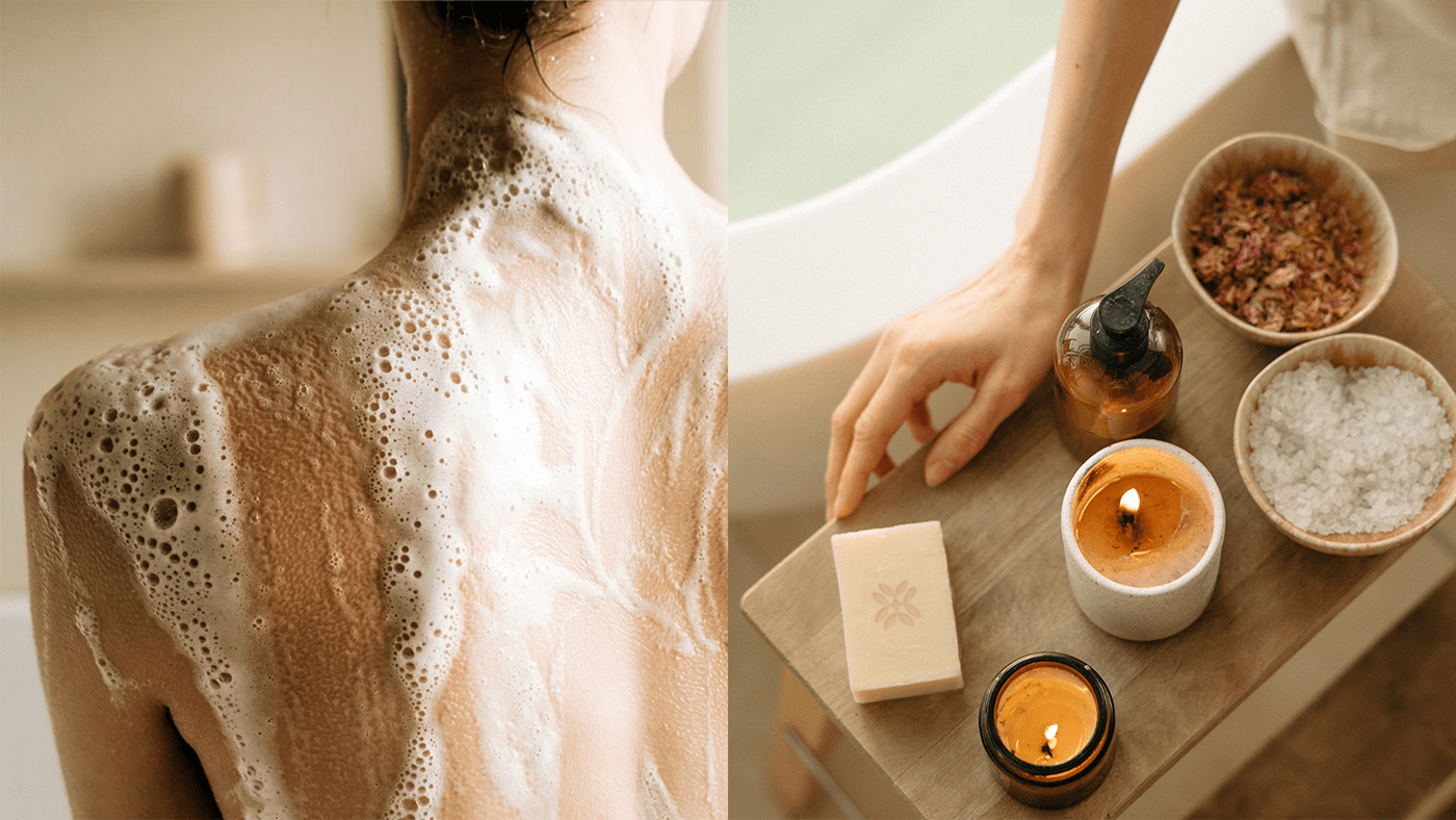
O slogan da marca, "da natureza ao chuveiro", sintetiza a conexão entre mente, corpo e natureza. O banho, além da higiene, é um momento terapêutico de relaxamento do corpo e da mente.
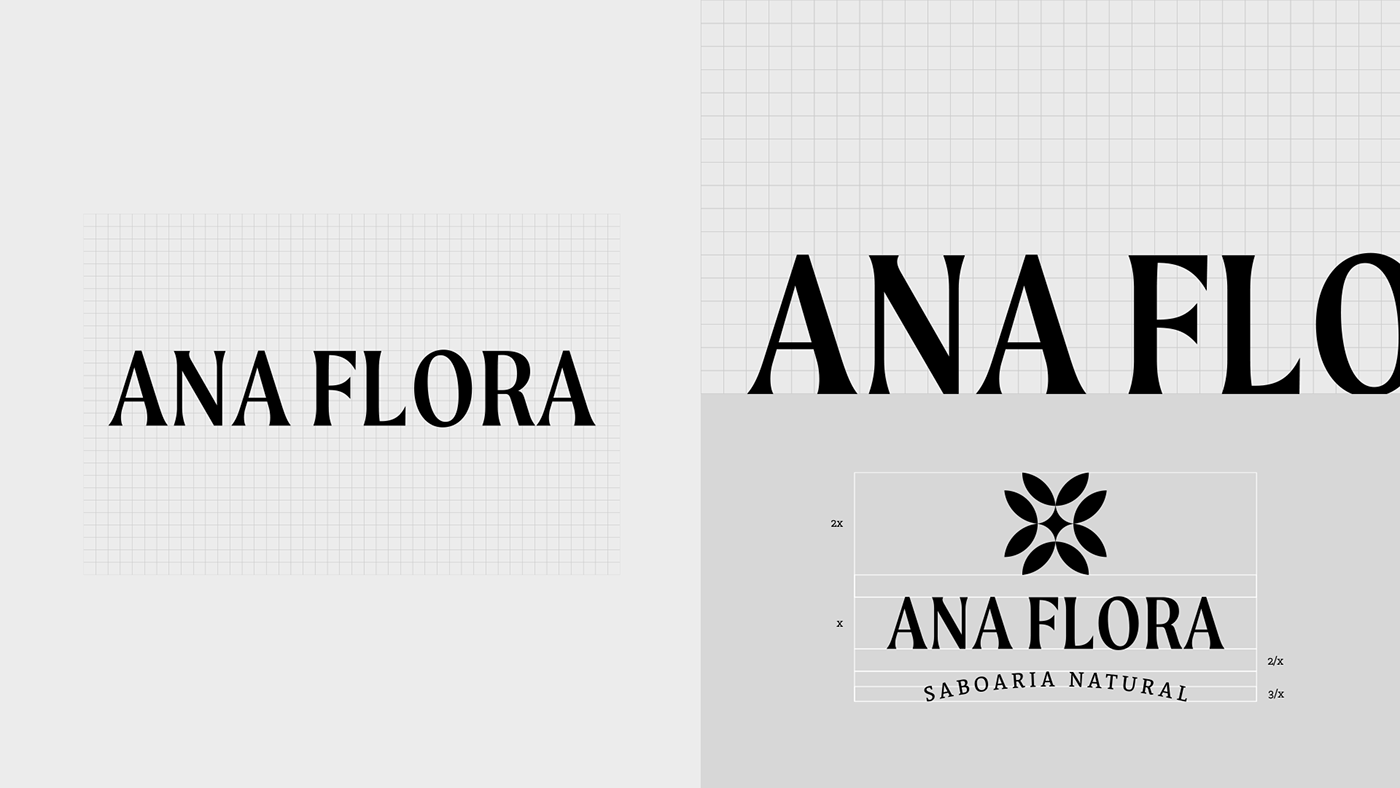
A solução de design foi criada com base no valor mais importante da marca: o cuidado. A escolha das cores, tipografia, grafismos e conceituação do símbolo foram cuidadosamente pensadas para evocar relaxamento, leveza e paz. Os traços do símbolo e da tipografia destacam a beleza e a simplicidade, resgatando a conexão entre a natureza e o ser humano.
-
EN
Ana Flora. From Nature to Shower.
Ana Flora is a natural and handmade soap company that emerged from the mutual interest in caring for people and nature. Founded by Ana Beatriz, an agronomist and nature enthusiast, her brand is a reflection of sustainability and care.
The brand's slogan, "from nature to shower," synthesizes the connection between the mind, body, and nature. The shower, beyond hygiene, is a therapeutic moment for relaxing the body and mind.
The design solution was created based on the brand's most important value: care. The choice of colors, typography, graphics, and symbol conceptualization were carefully designed to evoke relaxation, lightness, and peace. The symbol's strokes and typography highlight the beauty and simplicity, rescuing the connection between nature and human beings.
Client: Ana Flora
Services: Brand Strategy, Brand Identity, Art Direction, Print & Packaging.
Services: Brand Strategy, Brand Identity, Art Direction, Print & Packaging.


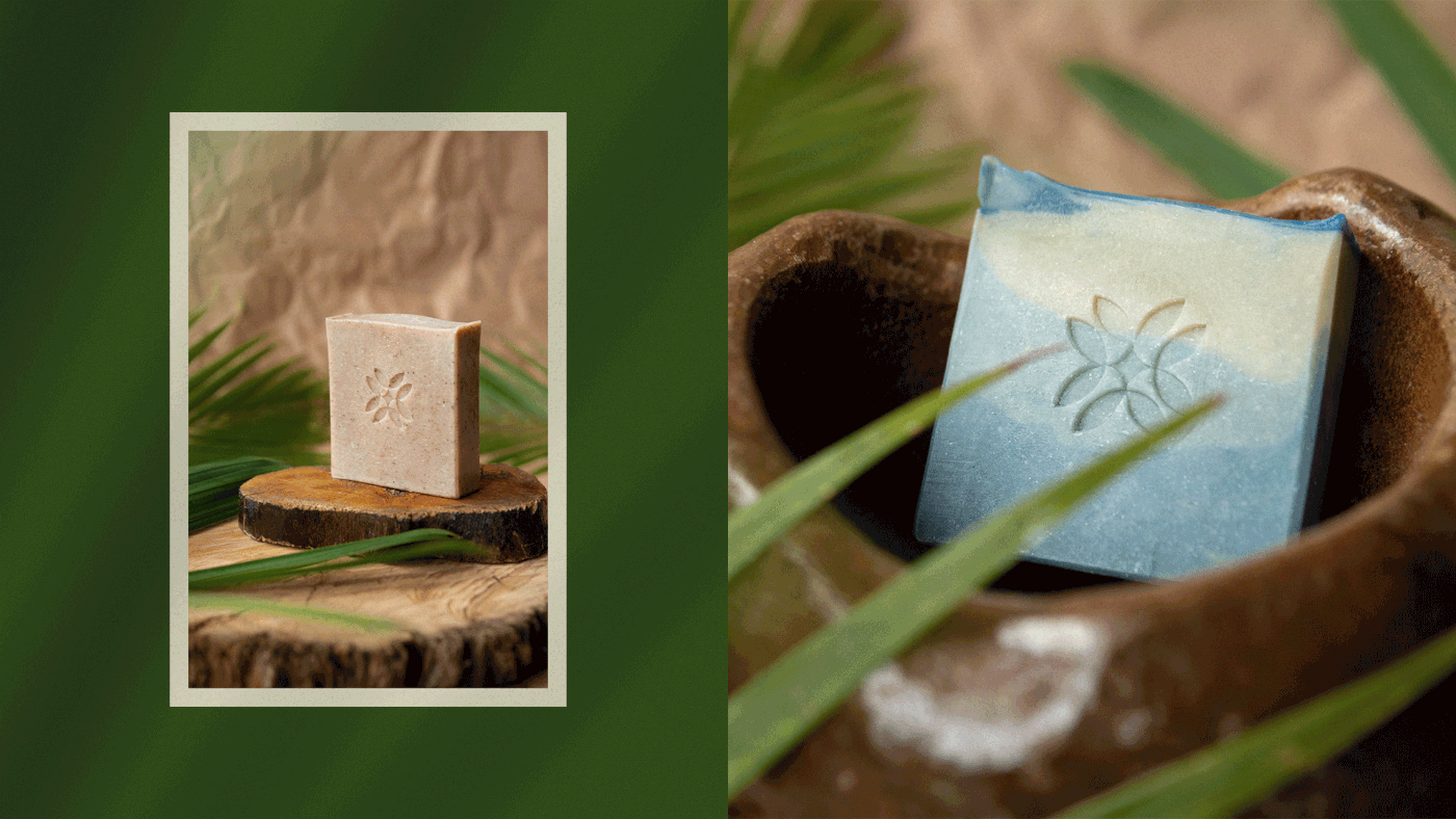
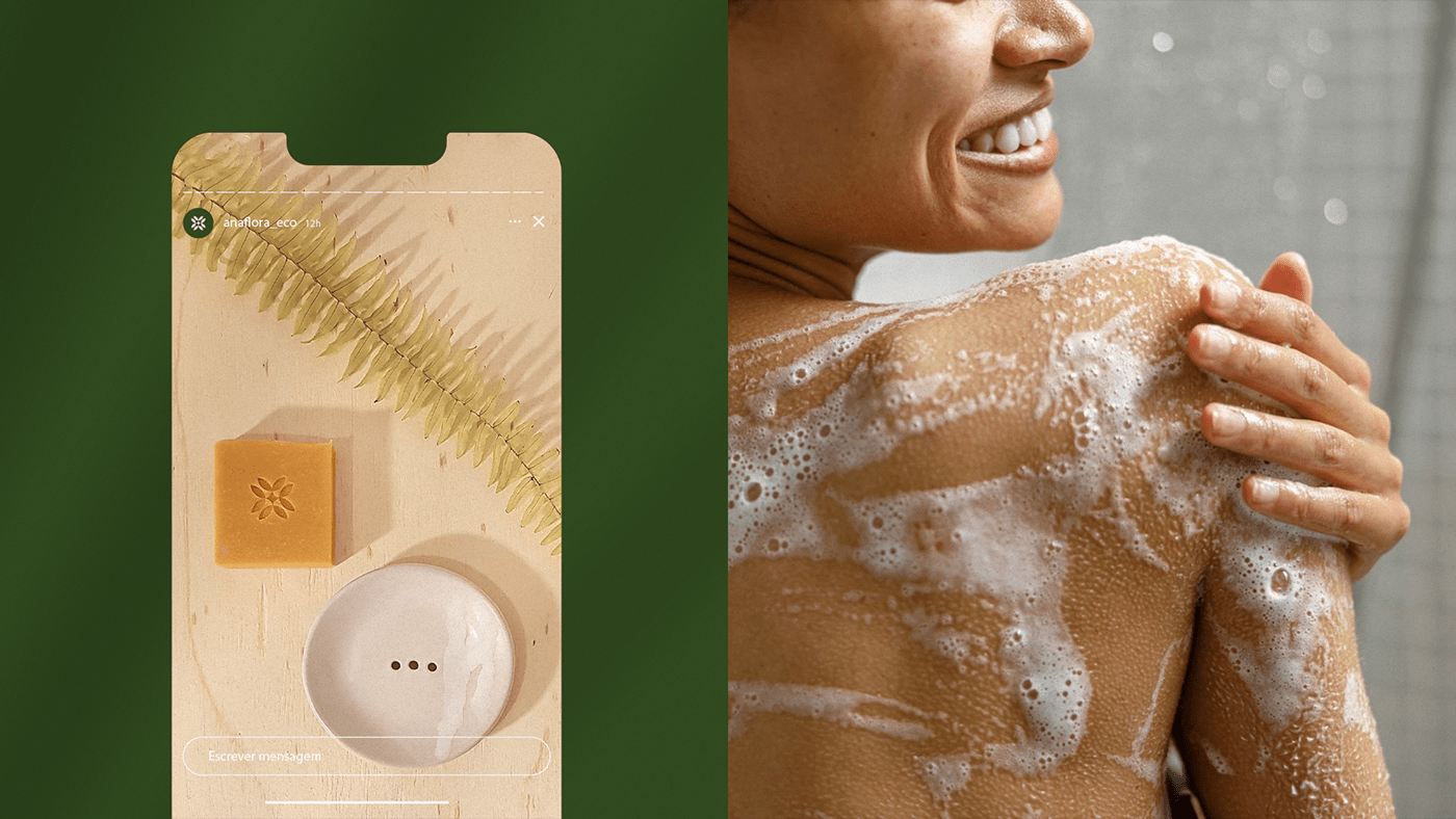
O símbolo elaborado para expressar visualmente a marca é a representação do brotar de várias plantas que compartilham um mesmo ponto comum - o centro. Assim como um círculo, seus traços não têm começo nem fim, representando os ciclos da natureza. É a combinação da simetria e harmonia dos traços geométricos com a beleza e simplicidade da natureza.
EN
The symbol elaborated to visually express the brand is the representation of the sprouting of various plants that share a common point - the center. Like a circle, its strokes have no beginning or end, representing the cycles of nature. It is the combination of symmetry and harmony of geometric strokes with the beauty and simplicity of nature.
The symbol elaborated to visually express the brand is the representation of the sprouting of various plants that share a common point - the center. Like a circle, its strokes have no beginning or end, representing the cycles of nature. It is the combination of symmetry and harmony of geometric strokes with the beauty and simplicity of nature.


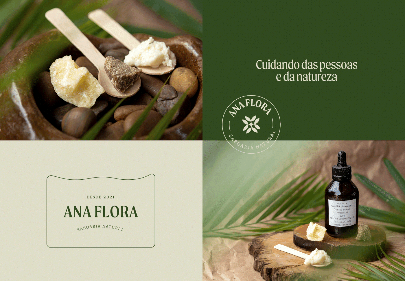
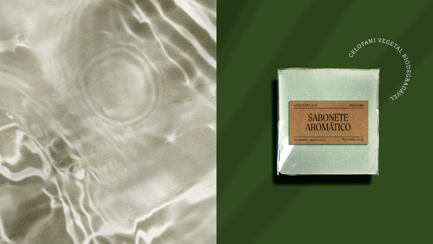
Desde a escolha dos ingredientes até a embalagem, tudo é pensado e produzido de forma sustentável. Os sabonetes naturais são feitos artesanalmente a partir de óleos, manteigas vegetais e óleos essenciais que nutrem, protegem e perfumam a pele, além de não poluírem o meio ambiente.
EN
From the choice of ingredients to the packaging, everything is thought and produced sustainably. Natural soaps are handmade from oils, vegetable butters, and essential oils that nourish, protect, and perfume the skin, as well as not polluting the environment.
From the choice of ingredients to the packaging, everything is thought and produced sustainably. Natural soaps are handmade from oils, vegetable butters, and essential oils that nourish, protect, and perfume the skin, as well as not polluting the environment.


RutkaStudio
Creative Leader & Design: Victor Rutka
Creative Leader & Design: Victor Rutka
Photography: Victor Rutka, Ana Beatriz Torres
__
Follow me: www.instagram.com/victorrutka


